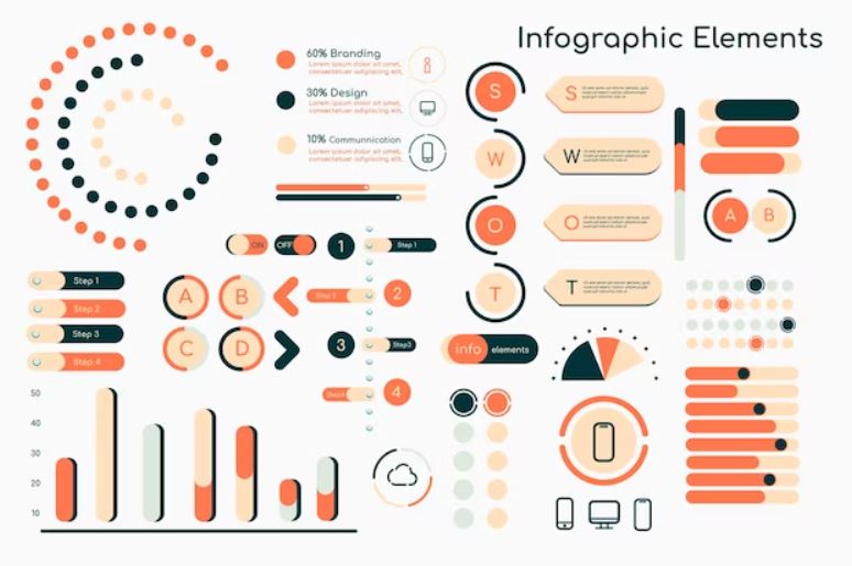
Infographics are a great way to engage prospects and customers and drive your content marketing forward. There are around 5.18 billion Internet users, and it’s up to you to give them compelling content that lets you stand out.
Are you ready to know what makes for a successful infographic? If so, keep reading for all you need to know about infographic elements.
Let’s get you started!
Visual Hierarchy
Visual hierarchy refers to the arrangement of elements within an infographic to create a visually appealing aesthetic and to communicate information. Several elements are essential components of an infographic that contribute to the visual hierarchy:
- typography
- color
- layout
- data visualization
- icons
- photos
- graphs
All these elements work together to create the visual hierarchy in an infographic and should be carefully selected and arranged for the most effective end product.
Icons and Illustrations
Icons are generally used to provide visual support to prompts, making your design elements more user-friendly and attractive. Icons can also help to reduce the need for text which can help keep your infographic focused and concise.
Illustrations are also an important part of graphic design, notes, charts, or tables can sometimes be tricky to understand. The use of illustrations can help to carry the message and visually organize the data, making it easier for readers to understand.
Data Visualization
Images are an essential element of any data visualization and should be chosen carefully to represent each point or data set. Color should be used to add emphasis to the data points as well as create a visually appealing design.
The text should be used strategically to simplify and explain complex topics in an easy-to-understand way. Lastly, layout and style should be used to create a visually pleasing piece. With the right combination of elements, infographics can add a layer of understanding to data visualization.
Typography
Typography is one of the key elements in any infographic, as it is the way the words and text are displayed. When designing an infographic, typography should be considered carefully to ensure clarity and consistency. The size, style, and color of the typography should be chosen strategically to engage the reader.
Specifically, choose fonts that are easy to read, and make sure the text stands out from the background. Additionally, ensure there is enough white space between lines and paragraphs so the text remains legible.
Finally, use the typefaces correctly – don’t mix and match them, and use a combination of bold and italic to emphasize words that need to stand out. Keep in mind, the main function of typography in any infographic should be to help enhance the message and create clear visuals for the viewers.
Color Scheme
Using a color palette helps the reader navigate the infographic. Bold colors attract attention to the information, whereas softer tones add clarity that calms the eye. Put some thought into the impact of the colors that you use.
They should work well together to convey the main idea or theme of your infographic. Make sure colors are contrasted to help readers identify relationships between data sets.
With all these combined, you’ll learn how-to-make-an infographic that stands out.
Understand Different Infographic Elements
Infographics can be helpful when looking to communicate data or information interestingly and engagingly. Knowing which infographic elements are available and which to use helps communicate information and engage an audience.
Challenge yourself to create compelling and informative infographics as a visual piece of content for your digital marketing plan. Start exploring possibilities and the power of infographics today!
Visit our blog Tech New UK for more articles.


